HERE ARE SOME EXAMPLES OF ALBUM ARTWORK FROM BANDS FROM A SIMILAR GENRE. AS YOU CAN SEE THEY ARE RATHER ARTY AND GRAPHICY, MUCH LIKE PISTOLA KICKS'S EP ARTWORK. WE COULD USE THESE AS INSPIRATION FOR OUR ANCILLARY TASKS.
I like the use of colour in The Pigeon Detectives album cover. However, this best suits their music and not Pistola Kicks's. To create consistency black and white or washed out colour should be used in our Digi-pack along with realistic but experimental imagery. Two red deer fighting is not realistic or something Pistola Kicks's audience would relate to. However, I like the simplicity and experimental style. Ours could be simple and experimental too.
Once again this is very experimental in style, yet simple. This works well as the album artwork looks almost like a scrapbook with the way the images of the band have been placed on the page. The band logo has also been used too. We will most likely include experimental features like this and the logo from Pistola Kicks's Myspace page. However, this scrapbook theme seems almost too random and meaningless to be relevant to our song.
Out of all these album covers 'Whatever you say I am that's what i'm not' by Artic Monkeys seems most relevant. This is because its realistic and downbeat because of the black and white colouring and realistic image - a man smoking. Our Digi-pack will most likely be like this too, yet with a bit more of a experimental style to attract the audience. I like the curvey box the band's logo has been placed in and the use of white to make the black logo stand out against the background image.
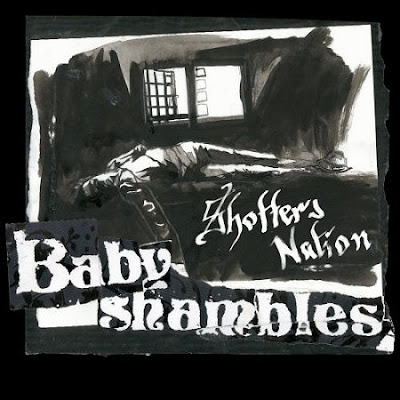
Although this album cover is painted, it is painted in an experimental yet meaningful manner. The dark colour choices and rather downbeat image of someone sleeping work well. It is this type of style we wish to create with our Digi-pack: experimental but realistic. I also like the use of the logo and the album title - not all of these album covers show the album title and it looks better when they do.
This album cover has been nicely composed and framed, there is so much going on yet it is simple. This uncluttered simplicity is what we wish to create with our Digi-pack. It is both downbeat and cheerful at the same time as a man is wearing black sitting on his own in a dark room - this connotes negativity. However, the sculpture in the centre of the room creates a sense of awe. I also like the use of the band's logo and album title as it finishes the media text off nicely.
This album cover is very colourful and complex, yet simple at the same time. This is because the main image is very detailed yet the background is white which balances the image nicely. We plan to get this balance of simplicity and experimentalism with our Digi-pack whilst creating meaning. I like how the album title has the same font as the band logo which creates consistency. We could do the same thing with our Digi-pack cover for the same reason and to attract the audience through logo recognition.
I like this album cover as it is simple yet meaningful. The band name is large so it stands out amongst the intentionally minimal features. The design is experimental yet simple and I like this balance as it is not too much for the audience to handle yet too dull for them to walk away. We have to get this balance with the black and white tones that our Digi-pack will have to be in because of the music video.


No comments:
Post a Comment